VELOIN
For the Swiss bike shop VeloIn we have designed a new logo, a new website and various graphics with great attention to detail.
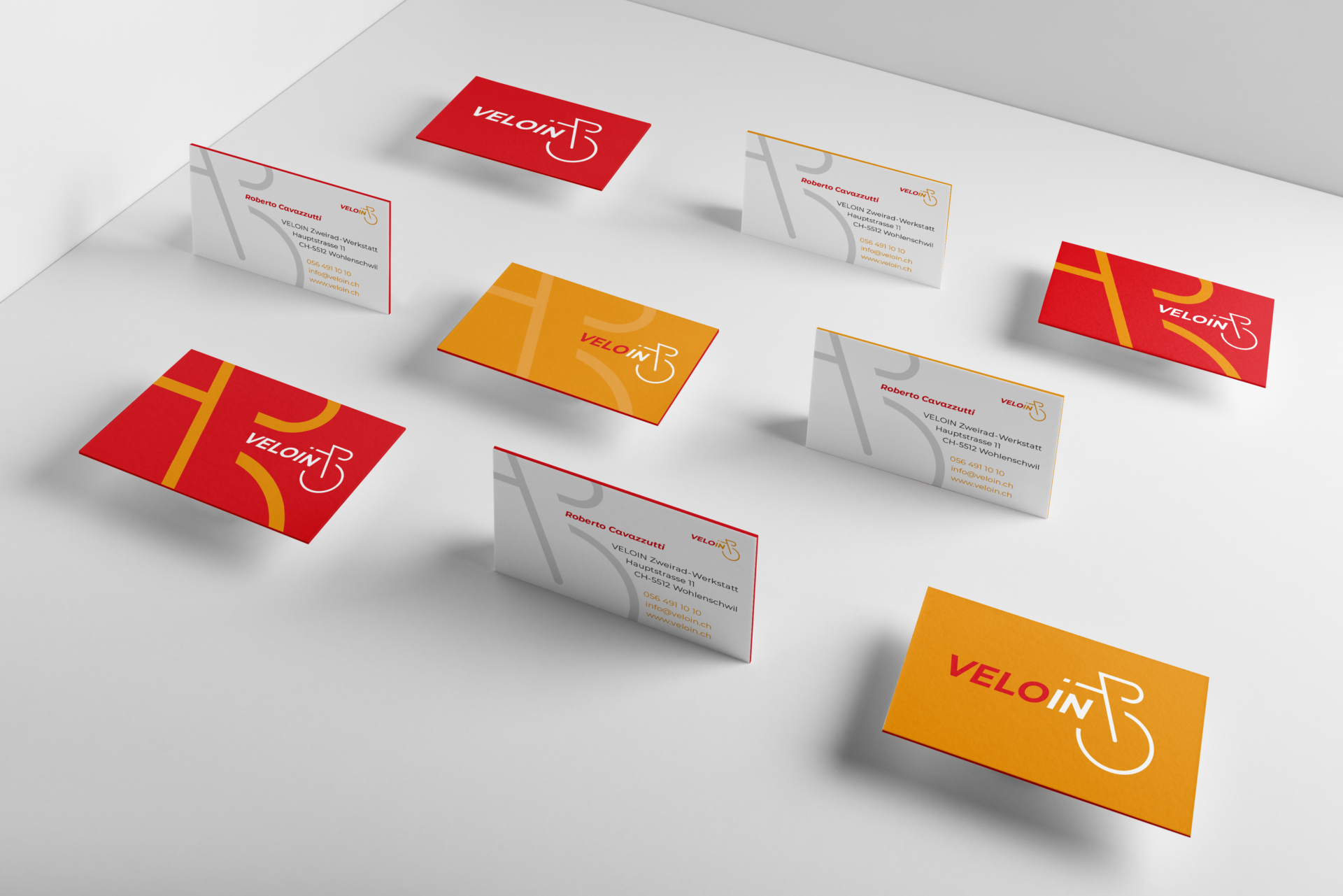
Run for Gold: The new business cards, arranged in the form of a peloton.
Development
LOGO
Development
LOGO
As always in creative processes, this logo development started with a brainstorming phase, accompanied by the sketching of different design routes.
Two rounds of presentations were necessary until the design work on the logo was completed, as well as a round of corrections for the final fine-tuning up to the final version.
To ensure that the appearance of “VeloIn” remains consistent in the future, we have compiled a logo manual for the customer.
This design manual contains detailed information about the fonts and colours used for the logo, the free spaces and the logo applications.
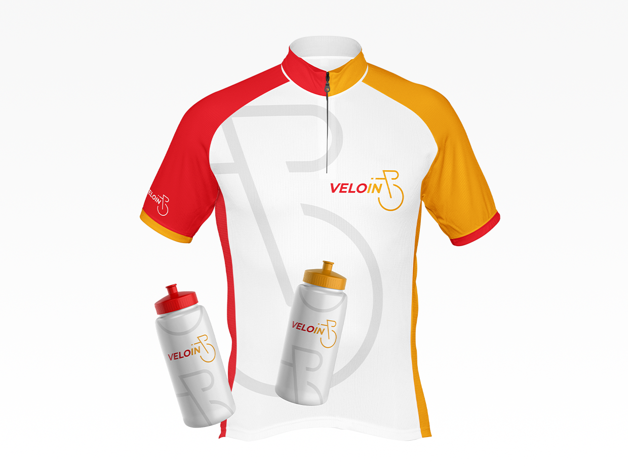
In addition to the logo and other design work, this full-service project also included the design of a bicycle jersey and corresponding bidons. We are of the opinion that the solution we developed is quite respectable.
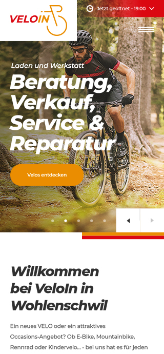
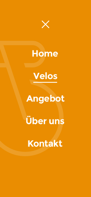
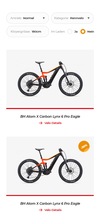
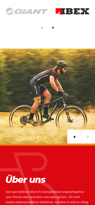
UI / UX
Webdesign
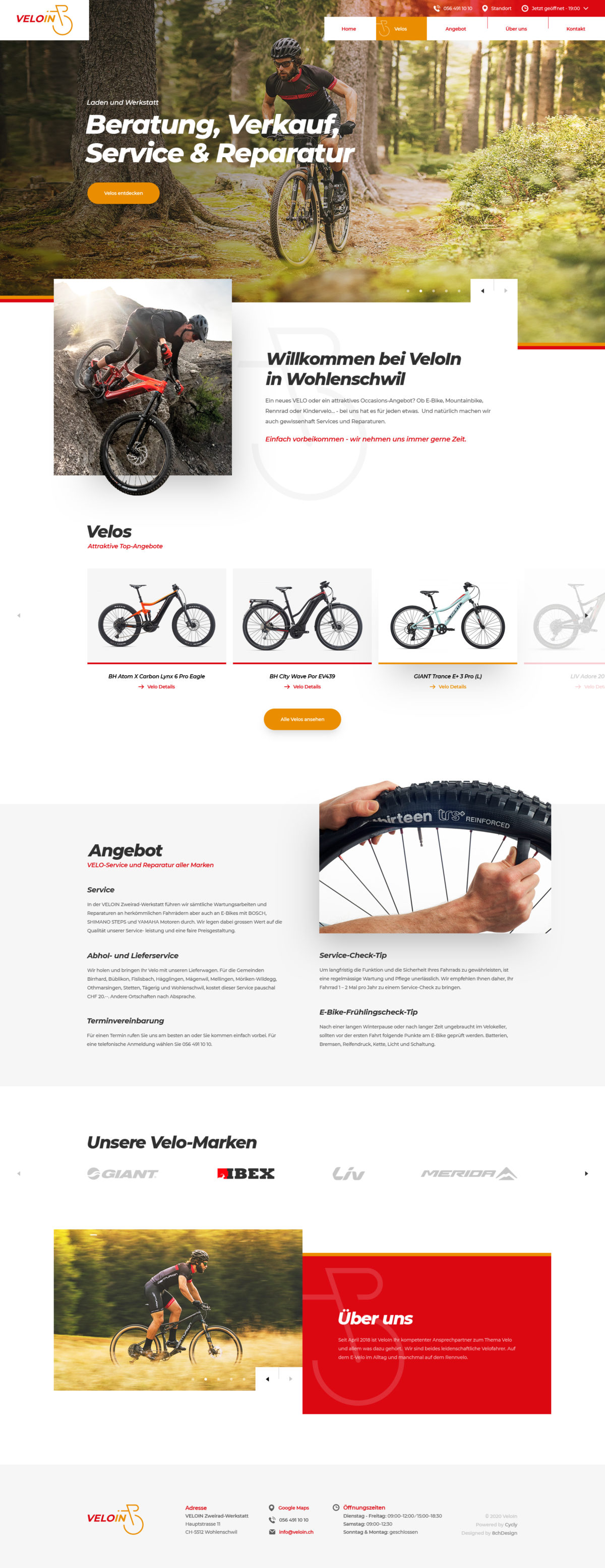
responsive & mobile